| Type |
Description |
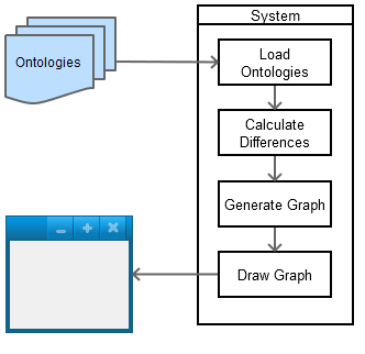
Graph Notation |
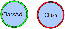
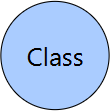
| Class |
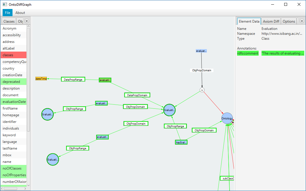
Classes are represented as blue circles with a black border and their class name inside. |
|
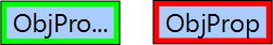
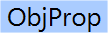
| Object Property |
Object Properties are represented as blue rectangles with their property name inside. |
|
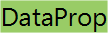
| Data Property |
Data Properties are represented as green rectangles with their property name. |
|
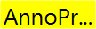
| Annotation Property |
Annotation Properties are represented as yellow rectangles with their property name. |
|
| Datatype |
Datatypes are represented as yellow rectangles with black borders that contain the name of their type inside. |
|
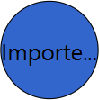
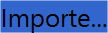
| Imported Class/Property |
Imported classes are represented as dark blue circles and imported properties are represented as dark blue rectangles. This color overrides the default color of the element. |
|
| Anonymous Elements |
Anonymous elements are represented with their default shape and colours but they do not contain any text inside. |

|
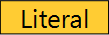
| Element Characteristics |
Element characteristics (Functional, Inverse Functional, Transitive, Symmetric, Asymmetric, Reflexive and Irreflexive) are represented as white rectangles with a black border containing the name of the characteristic inside. |

|
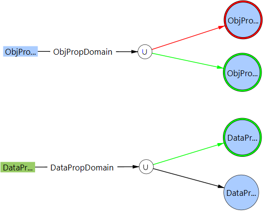
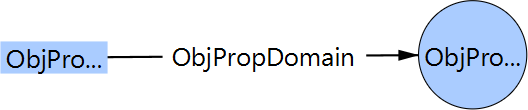
- Domain/Range
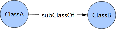
- Sub Class/Property
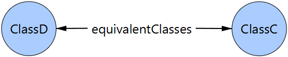
- Equivalent Class/Property
- Inverse Property
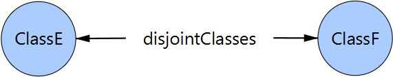
- Disjoint Class/Property
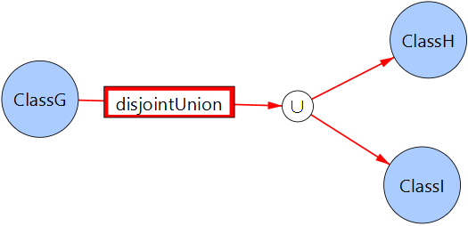
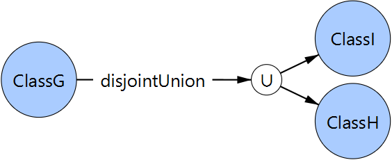
- Disjoint Union
|
The remaining graph elements are used to connect several nodes together. They are represented by their element name and the lines connecting them to several nodes. If the connection needs to connect to multiple nodes, an extra node (white colour, black border and a ∪ symbol) is added to the graph. |


|